Have you ever wondered what’s really in those high-resolution files you’ve been buying and downloading? Some websites selling high-definition music downloads have gotten in trouble when it was found that some of their offerings were merely 44.1 or 48kHz sources upsampled to 88.2 or 96kHz. You may be thinking, "My media-player software and/or DAC tells me the sample rate of the file I’m playing back -- isn’t that all I need to know?"
In a word, no. An upsampled file contains the same amount of data as a legitimately high-resolution file. If you look at the sizes of two files of the same length -- one of genuine high resolution, the other upsampled -- they’ll be the same. A file that has been upsampled from 44.1 to 96kHz will pass along to the DAC the same number of samples per second as one that was originally recorded or mastered at 96kHz. However, the upsampled file contains no more information than the file from which it was created. If the source had a sample rate of 44.1kHz, then neither it nor its upsampled version will contain frequencies above 22,050Hz. A legitimately high-resolution file, however, will contain frequencies above that limit.
The only way we can tell whether or not a file contains high-frequency information -- frequencies above those that can be preserved by the CD standard’s sample rate of 44.1kHz -- is to look at the frequency spectrum of a slice of the audio file. I have some experience in signal processing, so I could do such analysis and report my findings. Of course, I have neither the time nor the money to analyze all of the files offered by all HD download websites, so I thought it would be best to democratize the process -- that is, to provide readers with the tools and knowledge to go out and do their own analyses. The software I generally use for this, Mathematica, is rather expensive and can be daunting to those who lack a technical background. But Mark Waldrep, of AIX Records and iTrax, directed me toward a free, easy-to-use program that can generate the simple frequency spectrum that you need. I’ll begin by explaining how to use it, and then post some examples at the end.
Step-by-step instructions
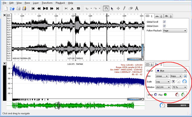
Download Sonic Visualiser, which is available for Windows, Mac, and Linux operating systems. There is no installer -- at least for the Windows version -- so just unzip the file and run the program. In the File menu, click on Import Audio File. Once the file has loaded, in the Pane menu click on Add Spectrum. I select the option to combine both channels, but it doesn’t really matter for this type of analysis -- you could look at one channel or the other.

To make your results look like mine, you’ll need to adjust some parameters in the panel to the right of the frequency spectrum. Adjust Bins to Linear. Adjust Scale to Log. Adjust Window to a high number -- I chose 262,144. We’re interested in low-level signals, so I left Threshold at -80dB and set Gain to +25dB. This means that, when reading the vertical axis of the graph, you must subtract 25; e.g., if it reads -55dB, the true reading is actually -80dB. It appears that Sonic Visualiser truncates everything to 16 bits, so you won’t see a noise floor lower than -96dB (-71dB on the graph). I could, therefore, have reduced the gain to +16dB, but because I’d already done much of the analysis, I left it alone for consistency’s sake. There are other ways of using Sonic Visualiser to do a frequency analysis, but they all lead to the same conclusions.
How to read the graph
The graph’s horizontal axis shows frequency, from 1Hz up to half the sample rate of the file -- e.g., 48kHz for a file sampled at 96kHz. It would be nice to have an actual scale written along this axis, but we can estimate with just the proportions. The height of the graph at any particular frequency indicates the energy at that frequency relative to other frequencies in the file. We’ll be more concerned with general trends than with specific values.
The above graphic shows a fairly typical high-resolution file. Most of the energy is concentrated in the lower frequencies (toward the left of the graph), and gradually decreases as the frequencies rise (i.e., move toward the right). Since the amount of energy between adjacent frequencies varies widely, the line indicating those energy levels jumps up and down. When the horizontal scale is compressed to show all of the frequencies in the limited space available, the result looks like a very thick line. You can clearly see that there is frequency content all the way to the right of the graph.
What you can’t tell from a simple frequency spectrum is whether that content is musically relevant information or just noise. The electronics in the signal chain -- microphones, microphone preamps, mixing boards, etc. -- add a small amount of broad-spectrum noise to the recording. If the recording was digitized from analog tape, tape hiss would also show up in the high frequencies. Acoustical noise from the recording venue is not distinguishable from the music, though it may still be relevant to the listening experience. Changes in the frequency spectrum as the file plays are most likely related to the musical program, while features that stay the same are most likely noise.
Let’s take a look at some other examples, and see what we can learn.

I can be 100% confident that this is an upsampled file, because I did the upsampling myself using HD Audio Solo from Cirlinca. The sample rate of the original file was 44.1kHz, and I upsampled it to 88.2kHz. You can clearly see an abrupt plunge at the halfway point. The original file could contain no frequencies above 22,050Hz, which is half the sample rate, so neither should the upsampled file. When playing the file, I do see occasional very small spikes in the right half of the graph. These are artifacts of the upsampling process.

This spectrum is a little more interesting. The sample rate of the file is 96kHz. We again see a steep drop-off at 22kHz, or just before halfway along the graph’s horizontal axis. There is, however, frequency content in the right half of the graph. This file may have been upsampled, and the high-frequency spikes may be artifacts of the particular upsampling process used. The only thing we can say for sure is that a steep filter was employed somewhere along the signal chain, and so the file contains no musically relevant information above 22kHz. For that reason, I wouldn’t consider this to be a legitimate high-resolution file. The frequency spikes in the left half of the graph are not artifacts. There is a single oboe playing at this instant in the recording, and those spikes represent individual notes and their associated harmonics.

This file was sampled at 88.2kHz. The steep drop at the halfway point again suggests a 44.1kHz original source. The steady rise in the graph above that point indicates that the file was derived from a DSD master. The energy in that band is the result of noise shaping, and is not related to the file’s actual musical content. It is not uncommon to find SACDs that have been derived from 44.1 or 48kHz masters in order to take advantage of the SACD medium’s ability to carry multichannel content. However, converting 44.1kHz to DSD to 88.2kHz certainly isn’t improving the fidelity of the recording. This is, essentially, a CD-quality recording with added high-frequency noise.

This file, too, is derived from DSD, but you can see how the natural rolloff and high frequencies blends into the rising noise floor from the DSD noise shaping. I have found that DSD recordings generally sound better when played back on an SACD player than when transcoded to PCM, but this is still a legitimately high-resolution file.

In this graph you can see a slight rise in the noise floor toward the right, above about 30kHz -- behavior typical of an analog-to-digital converter that uses noise shaping. The individual spikes suggest some sort of electrical interference during the recording or mastering process, since they remain in the same place when you look at different slices of the file. (The spikes look much sharper when a window is used that is appropriately tailored to the sample rate of the file, but the qualitative findings are the same.)
Let’s also look at the differences between files offered at 88 or 96kHz and those offered at the higher resolutions of 176 or 192kHz.
Britten: Simple Symphony, performed by the TrondheimSolistene, 96kHz file from 2L Records, downloaded from their HiRes Download Test Bench:

Looking toward the right, you can see a rolloff that begins around 40kHz and vanishes into the analyzer’s 16-bit noise floor by about 45kHz. It’s a gentle slope that will prevent aliasing without introducing too many other problems.
Britten: Simple Symphony, performed by the TrondheimSolistene, 192kHz file from 2L Records, downloaded from their HiRes Download Test Bench:

Remember that now the horizontal axis goes all the way up to 96kHz. You can see a steadily rising noise floor after about 50kHz. This recording was made in DXD, which is nominally a 24-bit/352.8kHz PCM system, but the white paper suggests that a 5-bit delta-sigma converter running at a very high sample rate could be used to derive the 352.8kHz master. Such an implementation would produce this result.
Britten: Fugue from a Reference Recordings 88kHz file downloaded from HDtracks.com:

In this file the rolloff begins much earlier -- at close to 30kHz -- and is below the noise floor of the analyzer by about 40kHz.
Britten: Fugue from a 176.2kHz file from a Reference Recordings HRx disc:

Here you can see the frequency content naturally rolling off across the entire spectrum, and hitting the noise floor of the analyzer before 80kHz. There is clearly frequency content in this file that is not there in the 88kHz version, but it’s impossible to say whether or not it is merely noise.
Conclusion
It’s important not to read too much into the frequency spectrum of a given recording. Not having abundant high-frequency content doesn’t necessarily make a recording bad -- there’s more to high sample rates than just preserving high frequencies. Conversely, abundant high-frequency information doesn’t guarantee a good-sounding recording. By now, though, you should be able to recognize the difference between a legitimately hi-rez file and one that has merely been upsampled. If a website is charging a premium for high-resolution downloads, then those files need to contain information beyond that which can be offered on CD. If they don’t, you should ask for your money back.
. . . S. Andrea Sundaram
andreas@soundstagenetwork.com


